RogerThat Electronics
RogerThat designs and produces boutique audio electronics for musicians — with a focus on guitar pedals and custom studio gear.
I founded RogerThat in 2010 and led all brand direction: logo design, visual identity, website, packaging, and marketing. The goal: create a recognizable, professional brand deeply rooted in music culture.


Logo & Branding
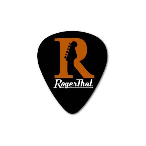
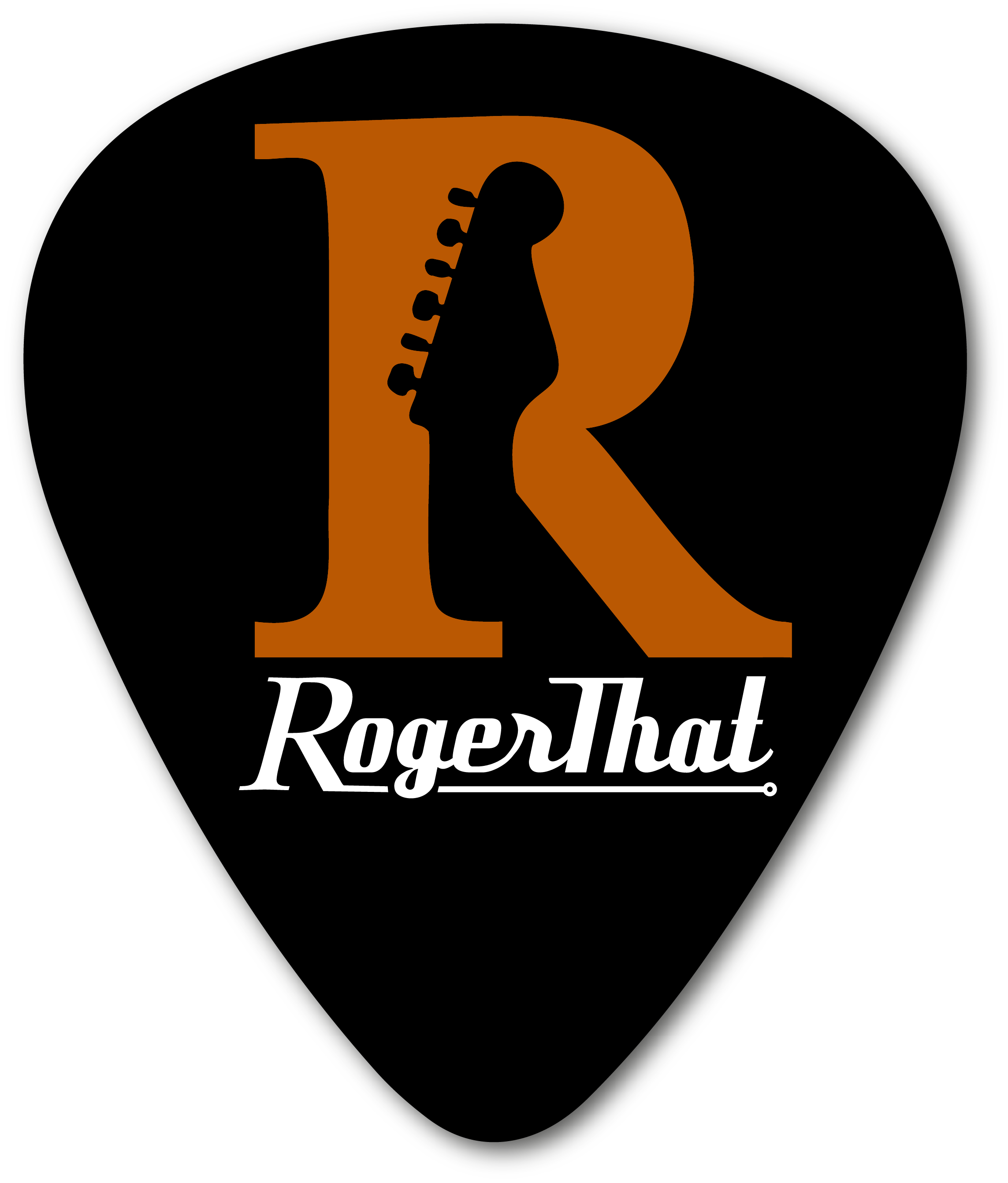
The logo was co-designed with negative space that forms a Stratocaster-style headstock, while the “R” references my name. The branding uses consistent colors, typography, and layouts that reinforce a high-end, music-savvy feel.
From packaging to pedals, the visual identity is intentional, memorable, and rooted in RogerThat’s connection to the creative audio community.
Website
The RogerThat website targets professional musicians who demand quality tools for the stage and studio. It includes custom icons, product pages, media samples, and a full-featured webstore — all wrapped in a Bootstrap-powered, responsive layout.
RogerThat Pedals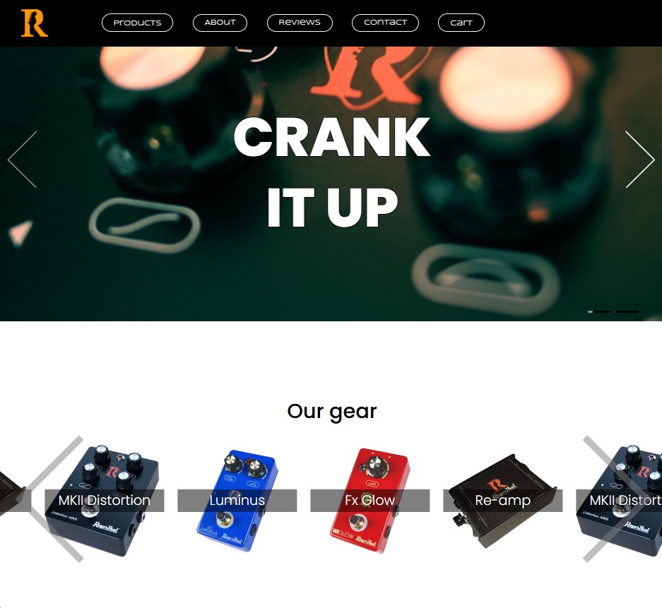
Colors
The house style revolves around orange (#FF9500), white, and black. Orange conveys energy, white clarity, and black represents rock-and-roll edge — a combo that reflects the brand’s identity.
Icons
The brand features custom icons used both online and on hardware products. They appear within rounded rectangles to reflect the tactile experience of analog gear.

Typeface
The primary font is Futura Light, a geometric, modern typeface that supports clarity and professionalism while preserving the creativity of the brand.
Futura Light
abcdefghijklmnopqrstuvwxyz
ABCDEFGHIJKLMNOPQRSTUVWXYZ