
RogerThat specializes in designing, producing, and selling boutique audio electronics for musicians, primarily offering guitar pedals and custom studio equipment.
RogerThat is a company that I started in 2010. I had the responsibility of developing the brand, which involved creating the logo, establishing the housestyle, designing the website, and working on various other brand expressions.
From December 2011 till 2022.
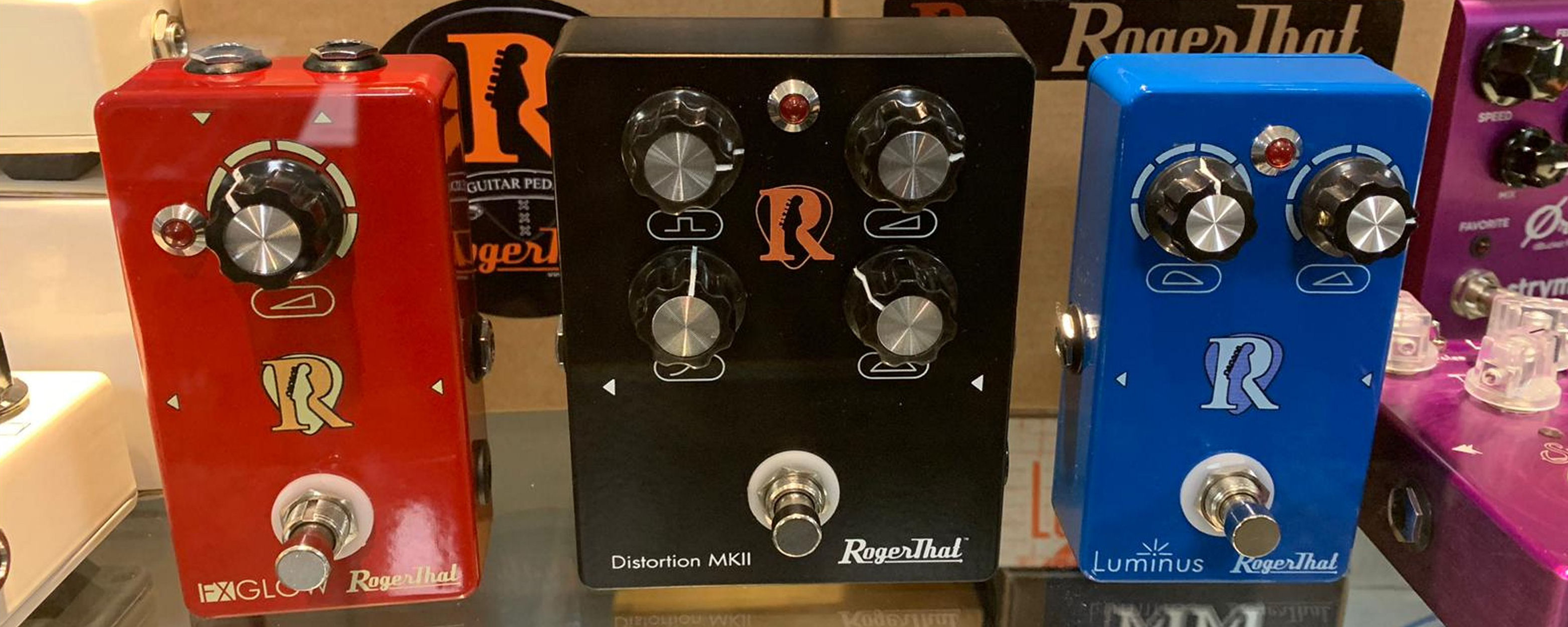
I have co-designed the logo, the aim was to create a recognisable shape that would stand out on the (hardware) products. By the use of negative space I have cut out a Fender Stratocaster's headstock and the R represents the first letter of my first name. The logo has been used in several colors such as blue, red and yellow on different products. For general brand expressions the ornage color is used.

The RogerThat house style emphasizes a clean and modern aesthetic, creating an appealing and contemporary look. This is achieved through the use of three primary colors: orange, white, and black. Orange signifies vibrancy and energy, white stands for clarity and simplicity, and black conveys a sense of rock and roll. These colors are carefully chosen to reflect the dynamic and professional nature of the brand.
Part of the RogerThat housestyle are icons that are used to display parameters, whether that is online navigation or a hardware potentiometer on a pedal. The icons are placed in a rectangle with rounded corners.

The main font for RogerThat is Futura Light. Its geometric shapes and clean lines contribute to the overall modern feel of the brand,
ensuring that all written content is not only legible but also aesthetically pleasing.
Futura Light
Small letters.
abcdefghijklmnopqrstuvwxyz
Capitals.
ABCDEFGHIJKLMNOPQRSTUVWXYZ
Every pedal has its own sound effect. I have tried to represent the specific effect by a color that fits the effect.
The black pedal is a distortion which creates a heavy metal sound.
The blue pedal open up the audio spectrum and create space a clarity, the red pedal gives "a spark".
For the screening on the pedal itself I have used icons that represent what they do. The icons are placed in an oval/rectangular shape.
All Rogerthat products follow these rules.

The RogerThat website is intended to project a professional and serious image, appealing specifically to professional musicians.
These musicians demand high-quality, reliable products that can be utilized on stage, in the studio, or in any high-demand, high-performance environment.
The website is designed to be informative and engaging, featuring a range of multimedia elements such as images, sound samples, and user-generated videos.
In addition to the rich media content, the website also includes a comprehensive webstore, serving customers from around the globe.
Just like on the pedals, the icons in the rectangles with rounded corners are used for navigation.
RogerThat Pedals