
Mokum Glas in Lood is an Amsterdam-based company founded in 2022, specializing in stained glass.
I was engaged to redesign their website, ensuring it is responsive and current. The website needed to feature a straightforward, one-page scrolling design with a clear call to action. Additionally, the design was intended to convey a more informal and personal tone rather than a strictly professional appearance.
October 2023.
Although I was restricted from making significant changes to the existing house style, I introduced a yellow color to enhance the overall liveliness. The typography was chosen to be simple, utilizing a large, easily readable font. Personally I would have gone for bit more modern approach without the transparant background images and a more explicit typography.
Mokum Glas in Lood uses the Roboto font on the website and a big font-size for easy readability.
Mokum Glas in Lood
Small letters.
abcdefghijklmnopqrstuvwxyz
Capitals.
ABCDEFGHIJKLMNOPQRSTUVWXYZ
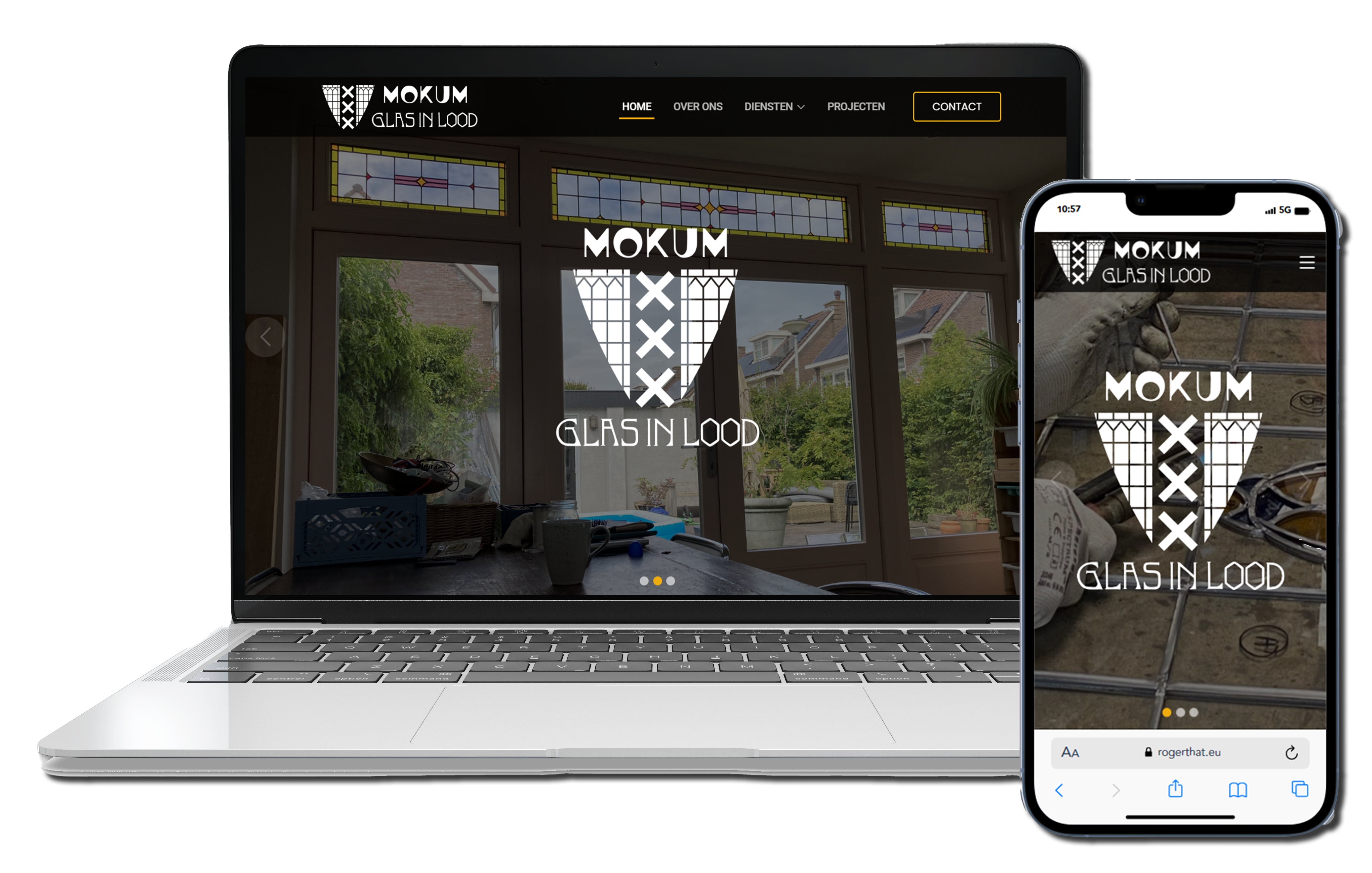
I have designed a one-page, scrollable website featuring a
dynamic image
gallery tailored to showcase various services.
The website includes animated sections that seamlessly
appear as users
scroll through the page. Additionally,
the client requested transparent background images to
enhance the visual
appeal behind both the information and images.
A large image gallery was added to showcase the
company's portfolio
and highlight its services.
Mokum Glas in Lood
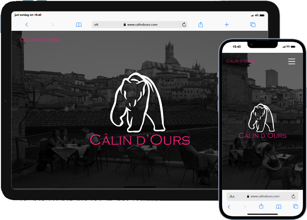
I approached the Câlin d'Ours website with a modern and
minimalistic aesthetic in mind.
I used the pink and dark-blue from the housestyle and
white
space to improve readability and keep the focus on the
content.
The layout I crafted is clean and intuitive, with
well-organized sections for products, brand history, and
purchasing options. My goal was to enhance the user
experience by ensuring easy navigation (call-to-action)
and
creating an inviting browsing environment.
The subtle animations and high-quality visuals were
chosen
to align with the brand’s theme of savoring life’s
simple
pleasures, contributing to a sophisticated yet cozy
atmosphere.
www.calindours.com