Calin d'Ours
Client
Câlin d’Ours is a Dutch startup dedicated to bringing premium Prosecco to the market. Established in 2024, the brand aims to blend traditional craftsmanship with modern elegance. Apart from (non)alcoholic beverages, Calin d'Ours wants to focus on merchandise as well, selling fashionable clothing and goodies.
My role and responsibilities
I was approached to help to create the brand starting with the creation of a logo, the housestyle, the website, and the marketing strategy.
Date
From December 2023 and ongoing.
Website
The logo
The client requested a logo featuring a grizzly bear and
incorporating the colors pink and black.
The design needed to be appealing to wear on clothing
like t-shirts, hoodies and baseball caps. The brand
targets women with a taste for luxury and fashion,
the brand's keywords included modern, fashionable,
luxurious, summer, together, friendship, and class.
Instead of using just a bear's head, we opted for
the entire bear silhouette, inspired by a frame from a
nature documentary about grizzly bears.
The specific frame was chosen for its dynamics yet
classy pose of the bear.
The outcome is a versatile logo that can be used
on
both black and white backgrounds by using the opposite
color for the bear's outline.
We selected an almost neon shade of pink to represent
warmth and femininity.
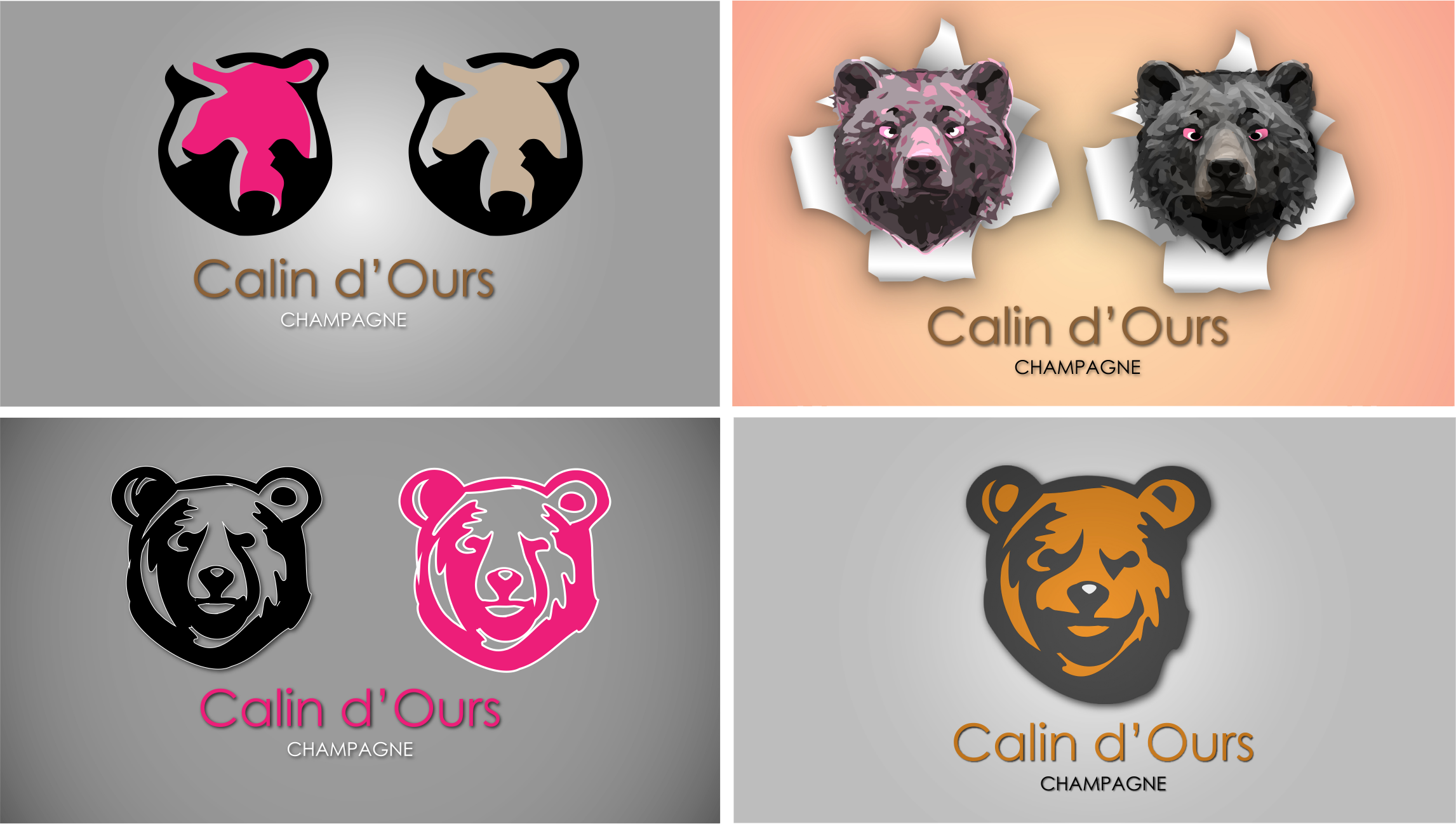
Image above: Several logo ideas through the process.
The colors
The housestyle was inspired by the pink used in the logo's
text. While designing the website,
we added dark blue to create contrast with the pink.
Additionally, the pink is used on black and white images to
make it stand out and create a recognisable style.
The typeface
The main font for calin d'Ours brand expressions is the
Poppins font,
it is used on the website, stationary and other brand
expressions.
For the Calin d'Ours brand name under the logo the font
Copperplate Gothic Light was used.
Calin d'Ours
Small letters.
abcdefghijklmnopqrstuvwxyz
Capitals.
ABCDEFGHIJKLMNOPQRSTUVWXYZ
The website - wireframe
From the beginning the client was very clear concerning the do's
and dont's on the website.
The website had to be built with blocks and squares to create
the sense of space and calmth.
The process began with wireframing to establish a clear and
intuitive layout, followed by selecting a soothing color palette
and high-quality imagery to evoke a cozy, inviting atmosphere.
The site utilizes subtle animations and responsive design
techniques to ensure a seamless user experience across all
devices, emphasizing ease of navigation and accessibility.
Another wish from the client was to have a vertical text
scrolling down in half the speed of the page when scrolling the
page down.
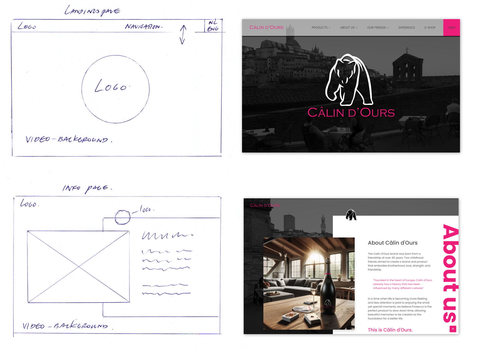
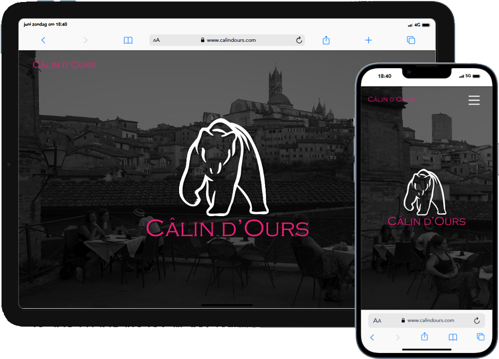
The website - aesthetics
I approached the Câlin d'Ours website with a modern and
minimalistic aesthetic in mind.
I used the pink and dark-blue from the housestyle and white
space to improve readability and keep the focus on the
content.
The layout I crafted is clean and intuitive, with
well-organized sections for products, brand history, and
purchasing options. My goal was to enhance the user
experience by ensuring easy navigation (call-to-action) and
creating an inviting browsing environment.
The subtle animations and high-quality visuals were chosen
to align with the brand’s theme of savoring life’s simple
pleasures, contributing to a sophisticated yet cozy
atmosphere.
www.calindours.com